Ferlux
strategy
brand universe
communication
VIKIÜ created a communication universe for Ferlux that expresses the exceptional potential of fruits.
While keeping the graphic identity of the company, VIKIÜ supported Ferlux in defining its strategy, its discourse and its brand universe.
Ferlux, a manufacturer of fruit extracts for the pharmaceutical industry, wanted to broaden its target by addressing the world of food supplements and at the same time broaden its range by offering a greater variety of fruit extracts.
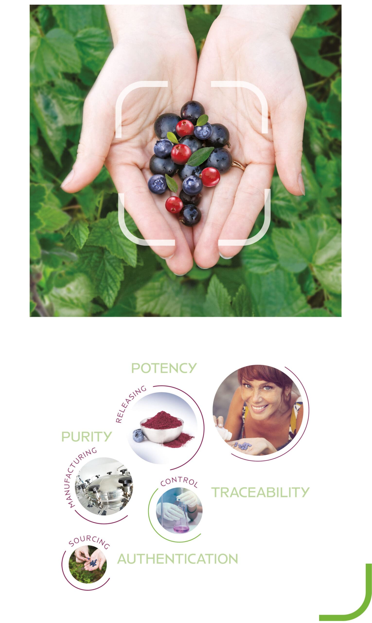
All the work done on the brand universe can be summed up in the brand slogan « Maximizing Nature’s Potential ». The objective is to leave a large part to the natural dimension by highlighting the raw materials, namely fruits, while keeping the serious and scientific aspect that characterizes Ferlux.
Ferlux’s flagship product is bilberry extract followed by many other red fruits, the chosen color register changes from purplish blue to a wine red associated with a fresh natural green.
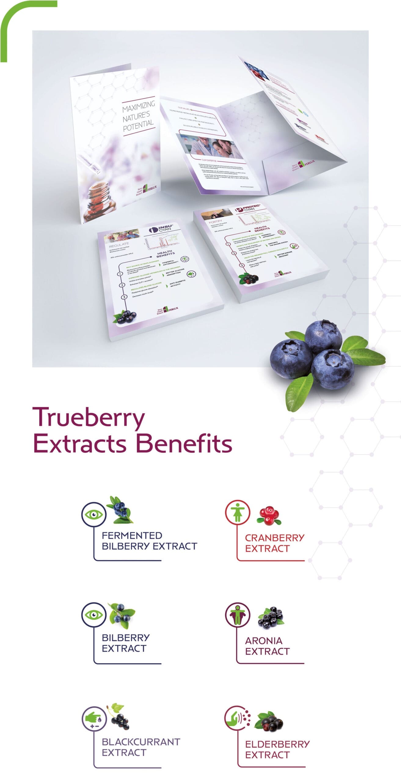
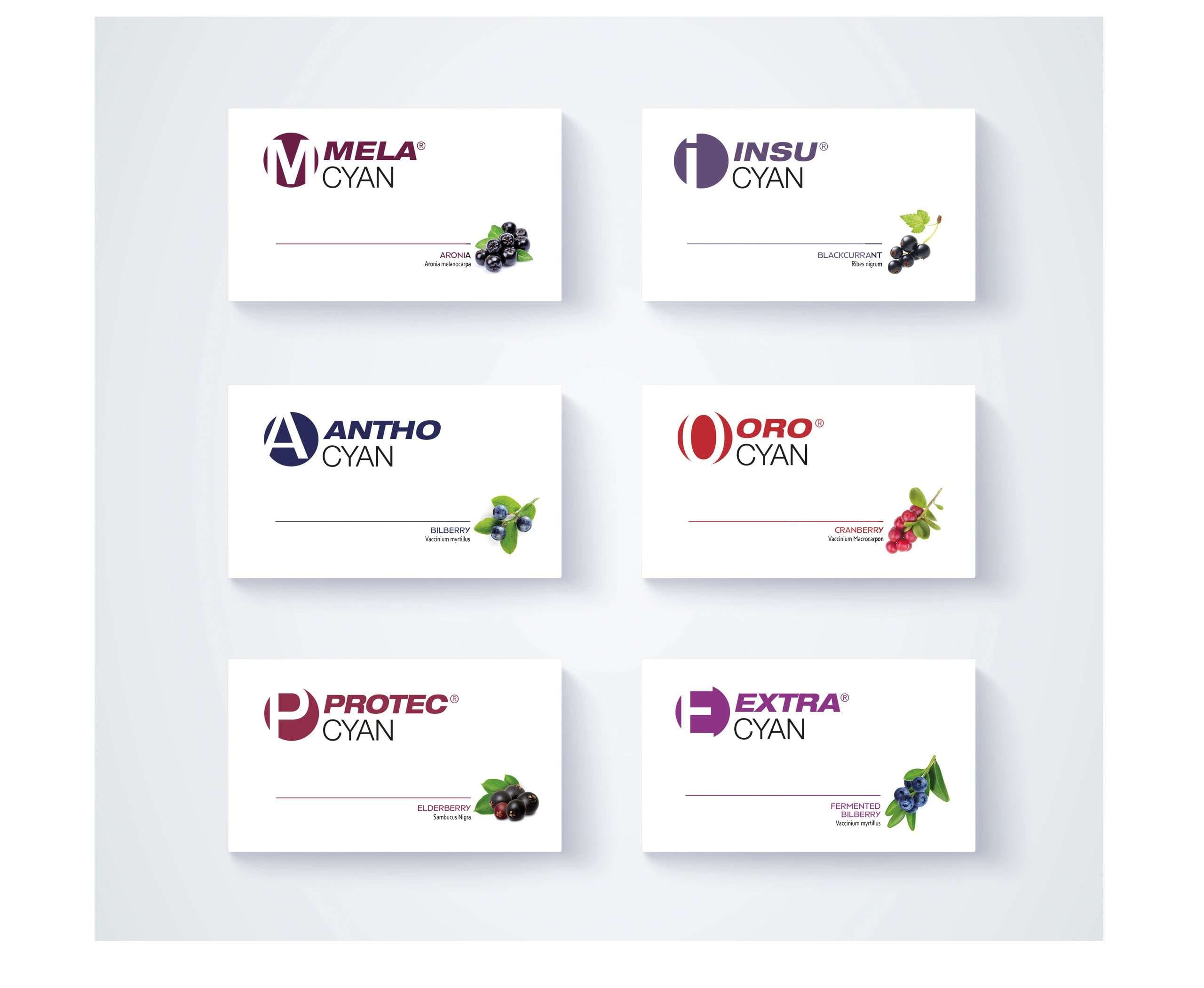
Each fruit has its specificities, which is why each range of fruit extracts has its trade name, in order to more easily present all the ranges, a logo has been created for each. These different logos are all built on the same basis, namely a circle that evokes the shape of the fruit and a letter that fits into it. The color of each range is chosen in proximity to the associated fruit.
The benefits of polyphenols are numerous and for that, it was necessary to be able to list the benefits in a didactic and aesthetic way, for this a series of pictograms was created to identify, at a glance the strengths of a fruit extract.
To highlight the benefits of polyphenols on health and well-being, smiling characters and faces illustrate the audiences for which its fruit extracts are intended.
