TREO
strategy
branding
brand universe
packaging
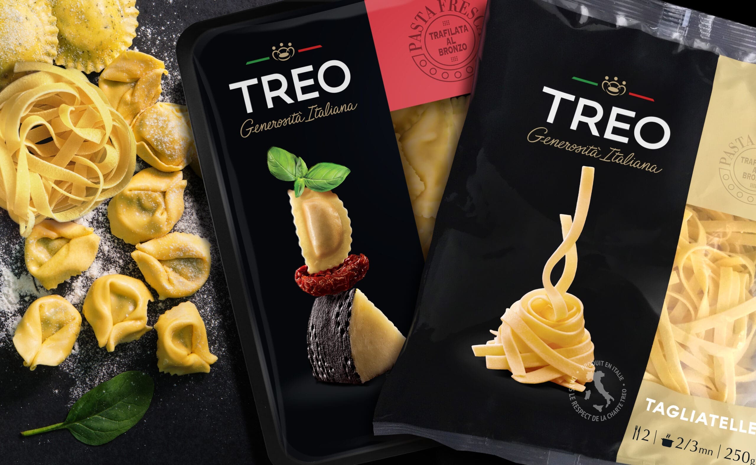
VIKIÜ anchors the TREO brand in the Italian spirit and enhances the ingredients, key in Italian cuisine
TREO was created twenty years ago by three Italians in love with their native cuisine. It is by searching in their family histories, by provoking unusual encounters, that they have gradually woven a network of the best artisans of Italian gastronomy. The TREO signature is a guarantee of the quality of ingredients and manufacturing methods, in order to bring you tasty products in the pure Italian tradition.
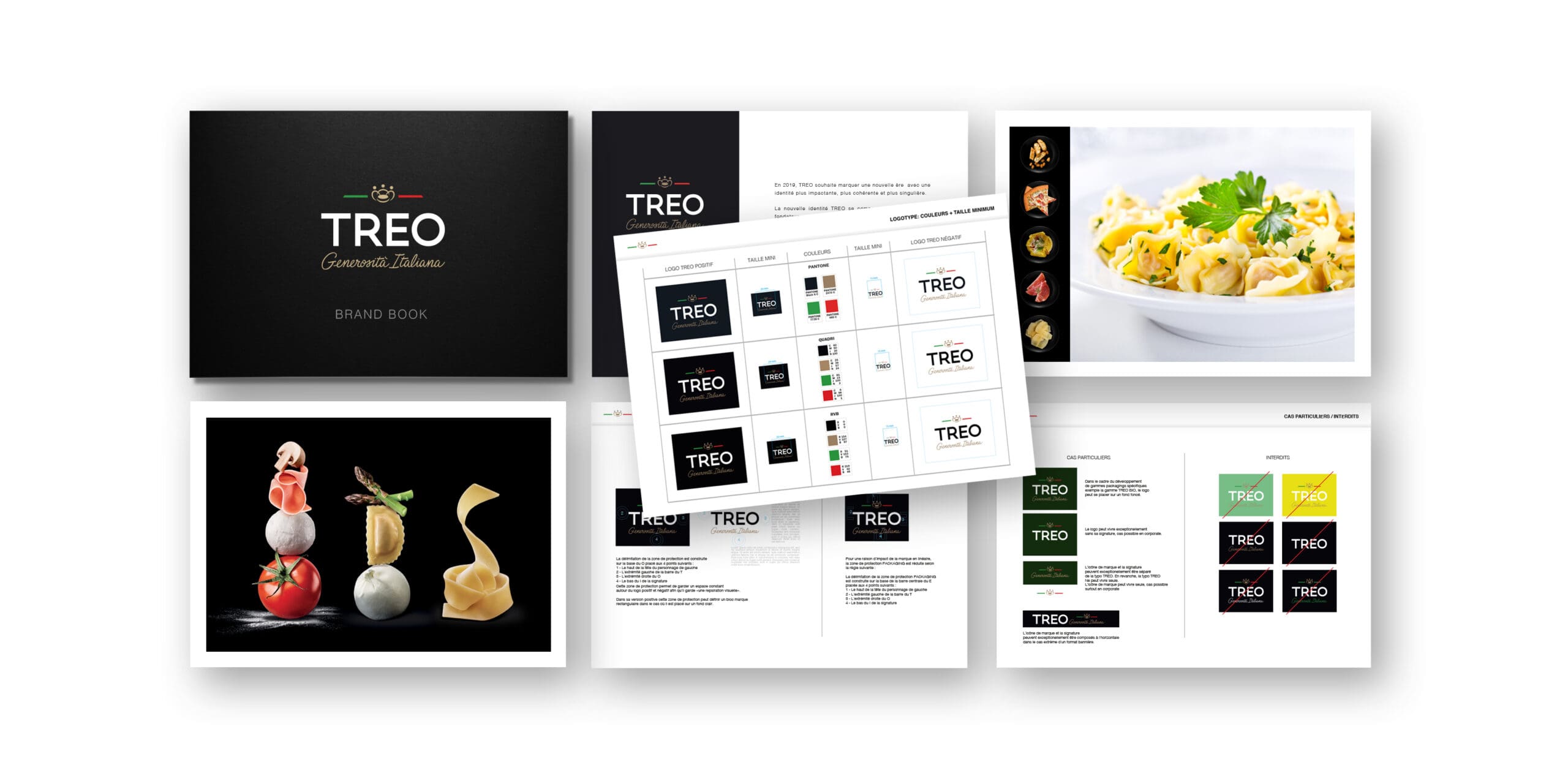
Building on this heritage, TREO needed a new identity that would allow it to write the future of the brand with the new issues and challenges set by the new team.
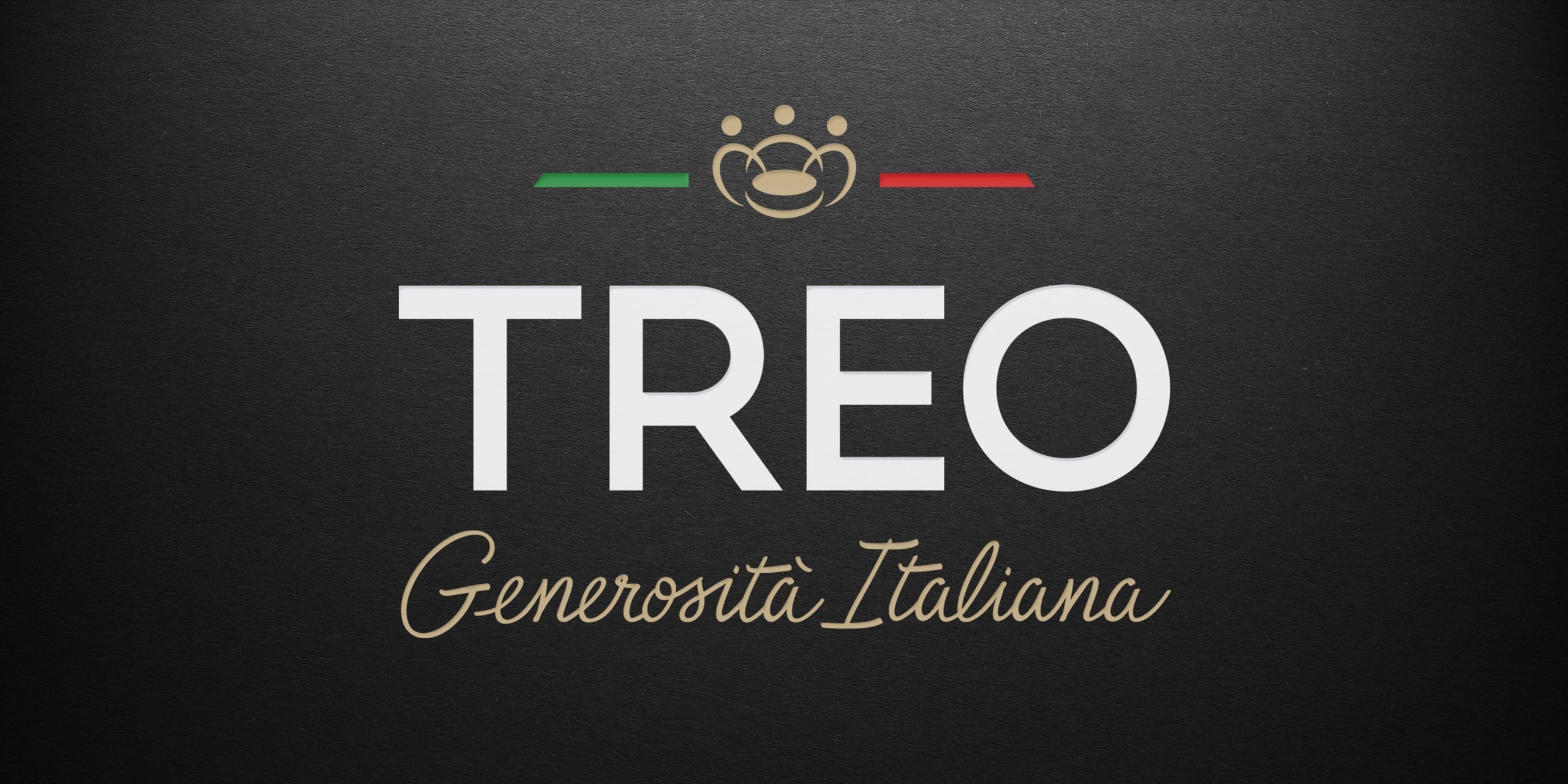
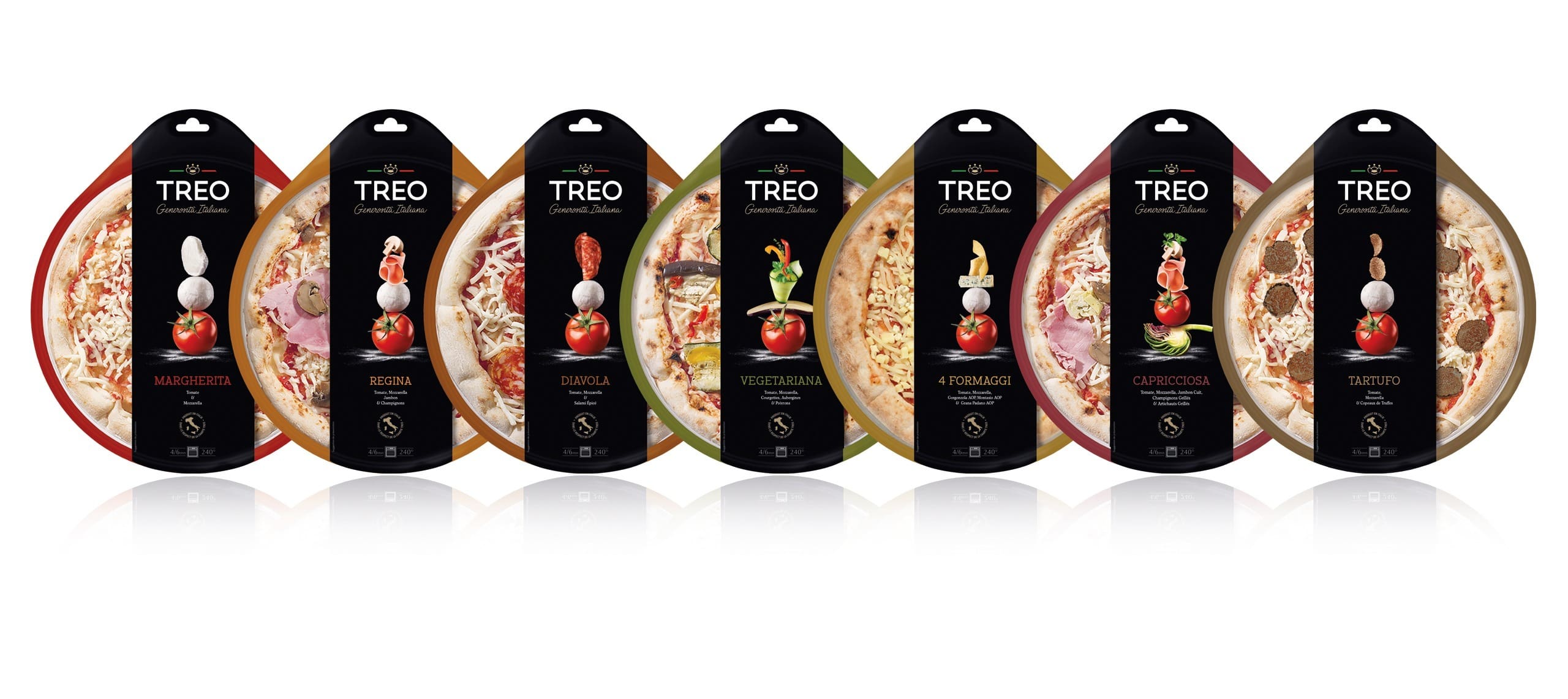
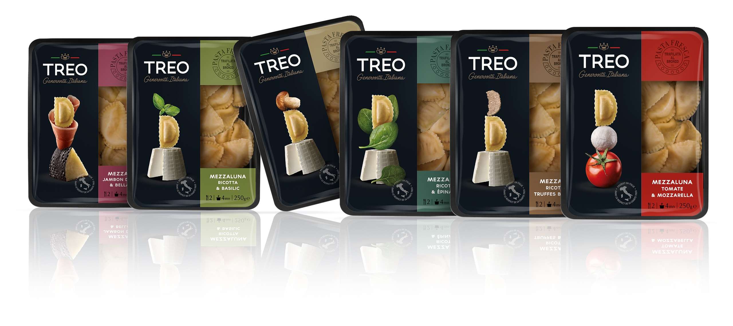
TREO’s new identity is simple and generous, like Italian cuisine. Black, the brand’s historic color, is retained to emphasize the qualitative aspect of the products and the brand’s uniqueness. The visuals are very distinctive by their verticality and sublimate the ingredients, key elements of Italian gastronomic know-how.

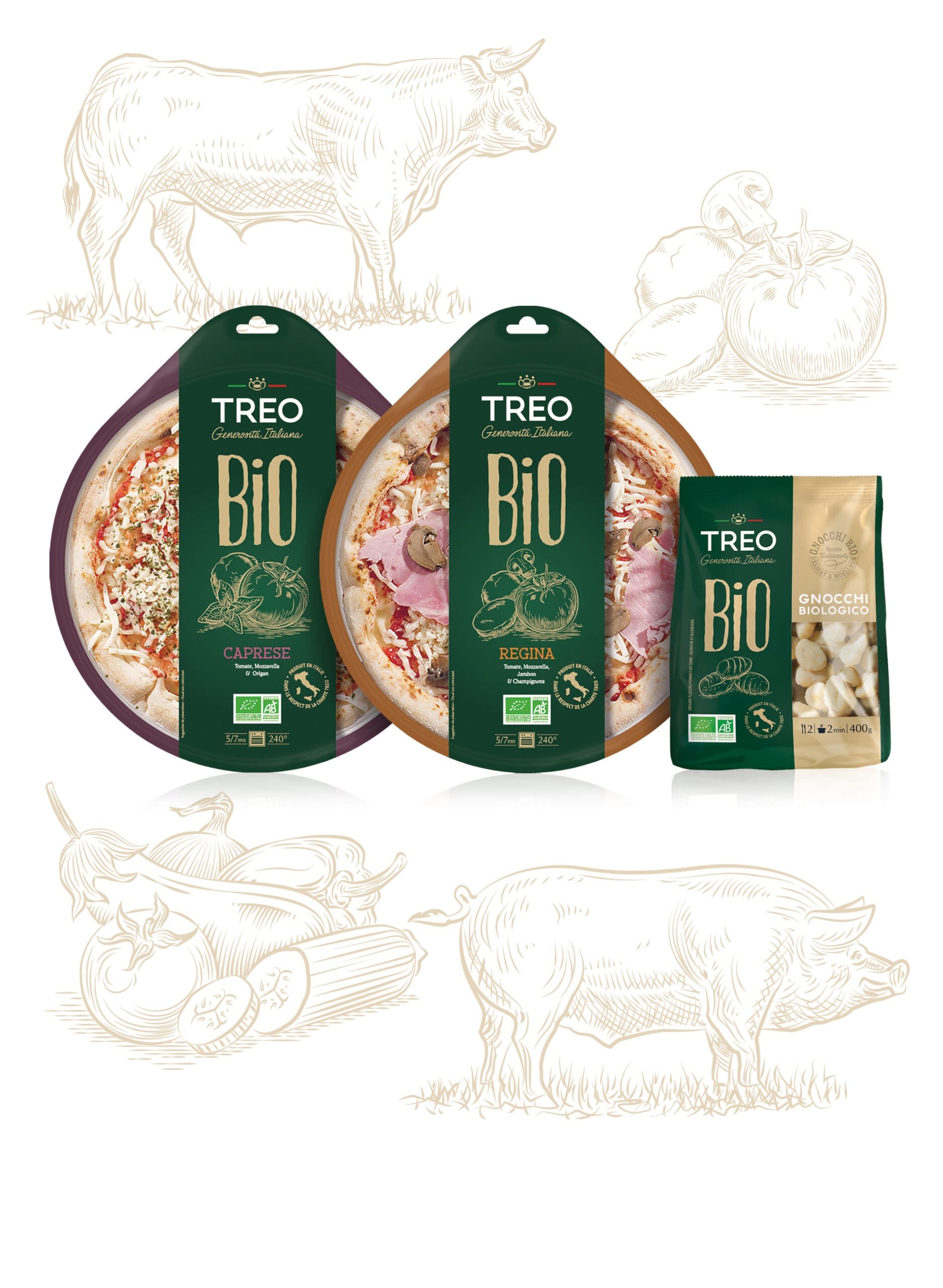
How to implement TREO in the organic world while respecting the brand’s style?
The organic range keeps the elegance of the TREO brand however the word BIO appears in the center of the packaging in a high lettering recreating the vertical aspect of the conventional range. The visuals of the ingredients are treated in an engraving style, which accentuates the perception of quality and tradition. The representation of the different ingredients remains the common thread with the other products of the conventional range.
